☰
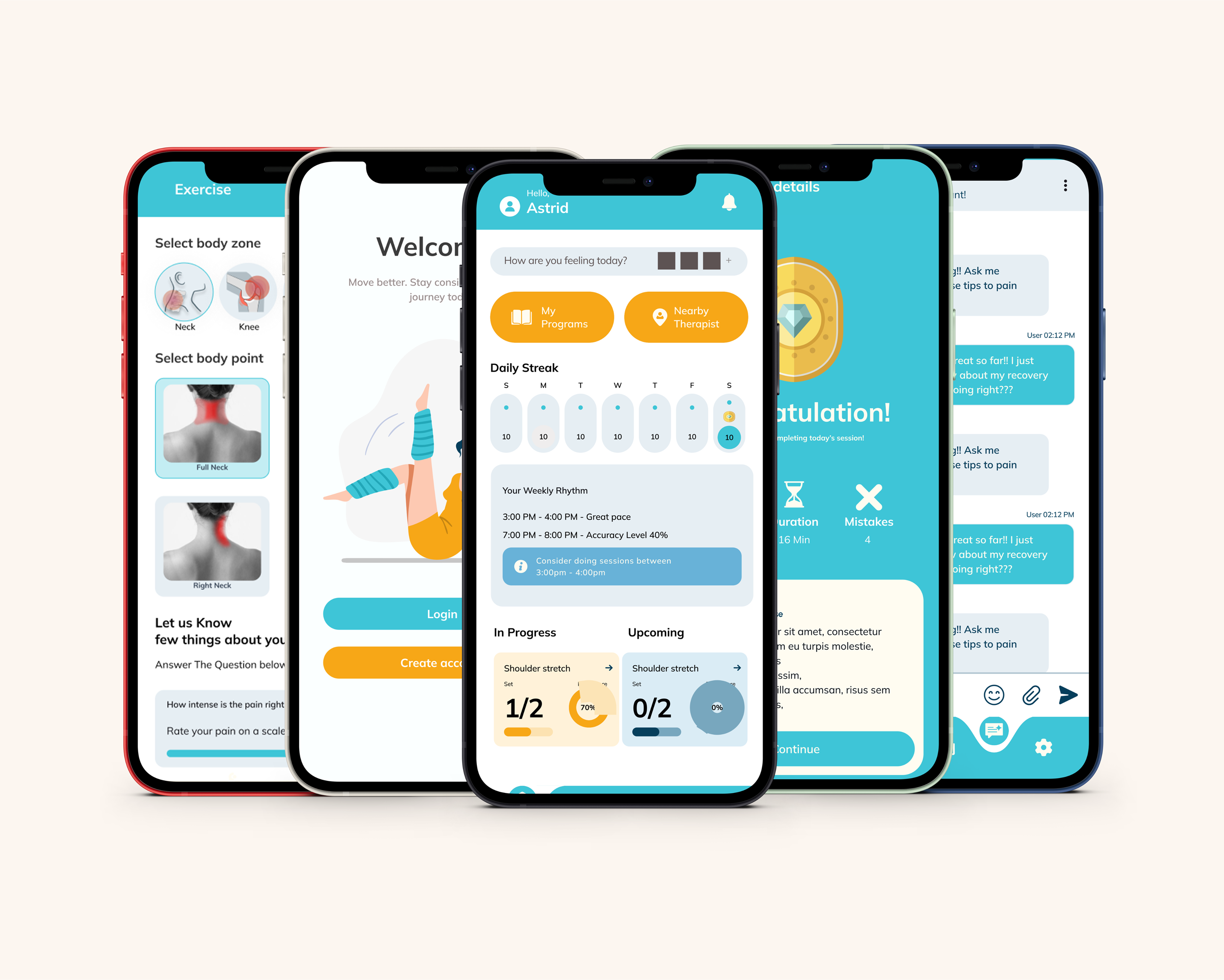
Kyntra is a mobile app designed to support recovery from non-emergency physical injuries. It uses the phone’s camera and AI to track body movement and provide real-time feedback during rehab exercises—making home recovery safer, more effective, and more accessible.
Many people dealing with injuries like shoulder stiffness or back pain can’t afford regular physiotherapy. At-home exercises are often done incorrectly without guidance, increasing the risk of re-injury and poor recovery.
Kyntra guides users through rehab with camera-based motion tracking and instant voice or visual feedback. It also includes a video library, AI support, and a clinic locator—helping users recover confidently without frequent clinic visits.

The Kyntra logo is designed to reflect movement, healing, and connection—core ideas behind what the platform stands for. The most distinctive part of the logo is the “K,” which is shaped like a person in a stretching or side-lunge pose. This design choice wasn’t just for style; it visually communicates that Kyntra is about physical recovery, movement therapy, and wellness. It gives the logo a human touch and creates an immediate association with exercise and body movement.


Mulish was carefully chosen to provide clarity, balance, and accessibility across all digital touchpoints, supporting a modern and user-friendly interface. The typeface offers excellent legibility with a subtle personality that aligns with the brand’s approachable tone. Mulish combines simplicity and sophistication, making it ideal for interfaces that require both function and aesthetic consistency.

Main font
Represents trust, clarity, and professionalism. It brings a fresh, modern touch to the design, creating a calm and reliable visual tone.
The vibrant accents—Soft Red, Royal Blue, and Lime Green—paired with Charcoal and Sky Blue, add contrast and energy. Together with Amber and Midnight Blue, these colors reinforce a clean, precise, and health-focused look, aligning well with the medical theme.

Icons

Buttons

activity

Analytics

Action buttons

tabs

Pop-up's

Header